Responsive Design

Your Comprehensive Resource for Tools, Tutorials, and Information.

Discover a treasure trove of HTML5 essentials tailored for developers of all levels. From beginner tutorials to advanced tools and expert tips, our comprehensive hub equips you with everything needed to excel in HTML5 development. Stay current with the latest standards and unleash your creativity with confidence.

find out

Responsive Design

Our website serves as a comprehensive guide
directing users to utilize responsive design tools like flexbox, grid layouts, and others for optimal website responsiveness across diverse devices.

Bootstrap

Free Application
 Bootstrap

A popular front-end framework for building responsive and mobile-first websites, offering a comprehensive set of CSS and JavaScript components.

Foundation

Free Application
  Foundation

Another robust front-end framework that provides responsive grid layouts, customizable components, and advanced JavaScript plugins for building responsive websites.

Google DevTools

Free Application
 Google DevTools

Built-in browser developer tools that include features for testing and debugging responsive designs, such as device mode, responsive design mode, and device emulation.

Am I Responsive?-

Free Application
 Am I Responsive?

A simple web tool that provides a quick preview of a website's responsiveness by displaying it in multiple device frames, helping designers assess the overall layout and responsiveness.

Viewport Resizer

Free Application
  Viewport Resizer

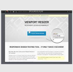
A browser extension that allows designers to quickly test and resize their designs for different viewport sizes, providing predefined dimensions and custom options.

Responsively App

Free Application
 Responsively App

A desktop application that enables developers to visualize and test responsive designs across various devices and screen sizes, offering synchronized scrolling and debugging tools.

sizzy

Free Application
sizzy

A browser tool that simulates multiple device screens simultaneously, allowing designers to test and preview responsive designs across different screen sizes and resolutions.

Grid Master

Unlock the power of CSS Grid for seamless layout designs.
Learn advanced grid techniques and create stunning, responsive websites with ease.

angry tools

Free Application
  angrytools

Quickly design web layouts, and get HTML and CSS code. Learn CSS Grid visually and build web layouts with our interactive CSS Grid Generator.

layoutit

Free Application
  layoutit

Quickly design web layouts, and get HTML and CSS code. Learn CSS Grid visually and build web layouts with our interactive CSS Grid Generator.

CSS Grid Generator

Free Application
  CSS Grid Generator

built with by sarah_edo. Columns. Rows. Column Gap (in px). Row Gap (in px). Please may I have some code. Reset grid. What does this project do?

cssportal

Free Application
 cssportal

The CSS Grid Generator is a web-based tool designed to help users easily create CSS grid layouts for web design.

CSS Layout Generator

Free Application
CSS Layout Generator

A CSS Grid generator & CSS Flexbox generator. A tool for generating UI layout component code.

Tailwind Grid

Free Application
 Tailwind Grid

Tailwind CSS grid generator is a tool that helps developers create custom Tailwind grid layouts more easily. The generator allows users to specify the number of columns, rows, the gutter size, the DIV width (span).

Griddy

Free Application
 Griddy

grid-template-rows defines how the elements will be divided into horizontal rows and how they will be sized in relation to each other. ... Defines the horizontal

Vue Grid Generator

Free Application
 Vue Grid Generator

CSS Grid Layout generator · CSS · HTML · Layout. grid size. w: h: Presets: holyGrail articleList.

Visual Grid

Free Application
  Visual Grid

Visual Grid Generator is the next grid generator on our list. It was created by Andreas, and the source code is available on GitHub. This generator has a clean and friendly UI.

CSS Tricks cheat sheet

Free Application

omprehensive guide to CSS grid, focusing on all the settings both for the grid parent container and the grid child elements.

GRID Malven Co.

Free Application
 Malven Co.

Malven Co. GRID: A simple visual cheatsheet for CSS Grid Layout Learn all about the properties available in CSS Grid Layout through simple visual examples.

FLEX Malven Co.

Free Application
 FLEX  Malven Co.

The Flexible Box Layout module makes it easier to design flexible responsive layout structures without using float or positioning.

Bootstrap 4 Cheat Sheet

Free Application
  Bootstrap 4 Cheat Sheet

Bootstrap 4 Cheat Sheet An interactive list of Bootstrap classes for version 4.3.1

Media Queries Cheat Sheet

Free Application
Media Queries Cheat Sheet

CSS 3, Media Queries Cheat Sheet Desktop - Tablet - Phone

uxpin

Free Application
 uxpin

responsive web design cheatsheet Guide.

Flex Flow

Master the art of Flexbox for flexible and dynamic layouts.
Dive deep into Flexbox properties and create visually appealing web designs effortlessly.

Flexbox Playground

Free Application
 Flexbox Playground

Flexbox Playground A web app for exploring Flexbox Reset to Defaults View Markup Container. Items. Edit properties of the flex container here.

IP Location

Free Application
 IP Location

CSS Flexbox provides a flexible and intuitive way to create various layouts, including responsive designs, equal-height columns, vertical centering, and distribution of space.

angry tools

Free Application
 angry tools

CSS Flexbox layout generator to create responsive container and flex items that adjust its position as per available space.

CSS tricks

Free Application
 CSS tricks-

guide to CSS flexbox layout. This complete guide explains everything about flexbox, focusing on all the different possible properties for the parent element

MDN Web Docs

Free Application
  MDN Web Docs

To create a flex container, set the area's display property to flex . When we do this, the direct children of that container become flex items.

flexbox froggy

Free Application
flexbox froggy

Froggy, a game where you help Froggy and friends by writing CSS code! Guide this frog to the lilypad on the right by using the justify-content

FLEXBOX DUCKY

Free Application
 FLEXBOX DUCKY

Flexbox Ducky, a game where you help Ducky and friends by writing CSS code! Guide this duck to the lilypad on the right by using the justify-content property

Flexbox Defense

Free Application
Flexbox Defense

Flexbox Defense combines the excitement of tower defense games with CSS Flexbox learning. In this game, you defend your castle by strategically placing towers along a path using Flexbox properties.

codepen Flexbox

Free Application
  codepen Flexbox-

Properties for the flex container

SUBSCRIBE TO NEWSLETTERS